 A special gift from the Earth & Sun on the last day of 2007.
Monday, December 31, 2007
Saturday, December 29, 2007

Thursday, December 27, 2007
light, shade & shadow

 The last workshop I took in the fall session was called "Light, Shade, & Shadow." Although we learned about shading in the earlier workshops, this one was focused on shading from a more general perspective. We learned how light and shadows fall on different objects like rope and silk ribbon.
Wednesday, December 26, 2007
bamboo weaves & trellises

 This artwork came from a workshop called "Bamboo Trellises & Weaves." The main idea we learned about here was where and how to shade it to make it look like the bamboo was weaving under and over itself. I found that taking the workshops also helped me to learn more about working with gouache so that I began to feel more comfortable mixing colors and applying the paint. My classmates agreed that spending the day painting with gouache really sped up the learning curve.
Sunday, December 23, 2007
to you and yours...
 May all beings have peace.
May all beings have love.
May all beings have joy.
May all beings have health.
May all beings have abundance.
vintage flowers

The next workshop I took was called "Vintage Flowers." We worked from existing pictures of flowers as reference to draw pleasing bouquets of flowers. Then we painted the flowers using a "vintage" palette which means we added sepia to each color to mute it so it would have a faded look.
Saturday, December 22, 2007
flower drawing
 The first Saturday daylong workshop I took in the fall session was "Realistic Flower Drawing." We brought in live Lillie's and drew them using various different pencils & smudging implements in order to achieve the shading. Although they are realistic looking, they are also somewhat stylized in that we changed the shading to adapt the image to the textile industry. Using the techniques we learned in this class, we can make realistic drawings of other subject matter that we may use in our textile designs. It is hard to give up one full day of my weekend but if I have to do so, making art is probably the best way to do it.

Friday, December 21, 2007
color
After our layouts were approved, we moved on to the color stage. Our assignment was to create several different color comprehensive (comp) designs. A color comp is a small section of the layout that the designer paints and presents to the client for approval before the final design is created. The comp must contain enough of the layout so that one can visualize what the whole design will eventually look like. For instance, it would not have been enough of the design if I only showed one motif (flower). My color comps were about 5" square whereas my layout was 18"x20". We used existing fabric as reference for our color combinations which were chosen by our instructor/client. Below are the first 4 comps that I presented.
 In this first one I added little dots to the layout to make use of another color which is light green although it looks like they are the same blue as the flowers in these pictures.
 In this comp, I used the same colors as the first one but changed the motifs by allowing more of the backfround color to show through in between the petals and leaves.
 Although this one looks like it is black & white, it is actually black and cream.

In this first one I added little dots to the layout to make use of another color which is light green although it looks like they are the same blue as the flowers in these pictures.
In this comp, I used the same colors as the first one but changed the motifs by allowing more of the backfround color to show through in between the petals and leaves.
 Although this one looks like it is black & white, it is actually black and cream.
 Out of the above four comps this is the one that my instructor/client approved but she requested that I modify the leaves making them green.
 One neat trick we learned at this stage was to use prepared acetate as a color overlay. Since the modification to my comp was simple, I was able to attach acetate to my comp and then paint the green color on it right over the leaves instead of making an entire new comp. All of the comps are hand painted so it is great to learn about time-saving measures like this.
With the addition of the green leaves, my comp was approved and I was able to move on to the final painting which you saw in this post. The shiny acetate made it difficult to photograph but you get an idea of what I'm talking about. That's it for this design. It took twelve weeks to complete! But that was because we were newbies. I have a feeling that things are going to speed up in January. Aside from this design, I took several day long workshops and I will post some of the work from them in the next few posts.
Tuesday, December 18, 2007
the process
 This was how the scribble flower design from the previous post started. Well, it actually started with a visit to the flower shop. Our assignment was to purchase a flower with a large face such as a lily or sunflower or Gerbera daisy, etc. and bring it to class along with the fattest black marker we could find. Once we were in class, we lined up all the flowers on a table and walked around it drawing the flowers individually. The idea was to be quick and try to fill the page which was 8.5 x 11. It was kind of like musical chairs as we stood in front of one flower awaiting the go ahead from the instructor, then we would draw furiously for about 3 minutes at which point she would tell us to stop and move on to the next flower. The above flowers are what I came up with and out of all those the instructor/client chose this flower as my motif.
Our next assignment was to reduce our motifs and create a "tossed" layout. The idea with a "tossed" layout is it is supposed to be reminiscent of having thrown the flowers in the air and letting them land where they will. In practice, it is more complicated. The goal is to have an evenly spaced design making sure that there are no "holes" or "alley ways" in the layout and each motif should rotate to aviod having a "Vegas slot machine" look. This is my layout.

My graphic design background gave me an advantage at this stage because my first layout was approved by our very demanding instructor/client. Some of my classmates who have not had any prior art background were required to do many revisions before having their layouts approved. I'm impressed with their efforts as this is a whole new world for them. Like many people, they have wanted to express themselves through art for ages but have been discouraged until now. It is exciting to see the flowering of creative expression that comes through us all. I continue to realize how fortunate I feel to have had parents who always encouraged me to be creative. That is not the norm and I will forever be grateful to them for that gift.
You may have noticed that I refer to my instructor as a client as well. That is because the school is structured in an effort to replicate the textile industry with the instructor acting as a client. I greatly appreciate this aspect of my education. It is my experience that most art education programs fail to address this important facet of an art career. In my next post I'll show you how we went from black & white layout to final color painting.
Monday, December 03, 2007
A new adventure
Although I usually make no excuses for not posting on a regular basis, I actually do have a good one for this latest hiatus. I began a Textile Design program and it has consumed my free time in a wonderful way. We just finished the first course of seven. It's a 2.5 year long program and at the end of it I'll have a portfolio that consists of original textile designs that have been both hand painted and computer generated. In addition to classes every Tuesday evening we also have daylong workshops on most Saturdays. I'm on my holiday break now but we were assigned tons of homework due in January when I will start my second course. Then I will also add another evening class learning how to use Photoshop with textile designs. So I hope to do some posting about what I've learned so far before January when I'll get buried under classes and homework and my part-time work again.

This design is called a scribble flower and I hand painted it using gouache which is a water-based paint that is very opaque and has a flat matt surface so it simulates fabric better than other water-based media. It differs from acrylic paint which is also water-based but is less opaque and has a shinier surface. The mixed media art that I have posted in the past was all done using acrylics. We will be learning water color techniques for more transparent designs later. Although I have used gouache before, it was about 20 years ago in my undergraduate art program. It is a persnickety medium to work with but is also very beautiful. So I have been re-learning how to work with it. It is also hard to photograph but you get the idea (above). Another difference is the painting style I am learning is very "tight-handed" rather than "loose-handed" which is what most of the art I have done for the past 10 years has been. We will be working on looser designs later but it is important to know how to do both for the textile industry. I'll post more about how this design came into being and what I've learned in the weekend workshops soon.
Tuesday, September 11, 2007
We Can't Make It Here Anymore - by James Mcmurtry
I'm feeling sadness and grief on this anniversary. This music and video say a lot and I'm sure that there are many who strongly disagree with the sentiments. I appreciate that there are many differing views... after all that is one of the things I love about our country. I hope that all who suffer may have peace.
Tuesday, August 28, 2007
Abundance and Sun Salutations
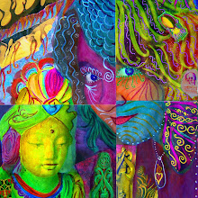
 I have been busy playing with photoshop lately but did take some time away from the computer to work on some non-digital art. I'll post some of the photoshop stuff when I have something interesting. This first piece is an affirmation that I have been thinking about, talking about and living for a while now... probably the last seven years. It started when we bought our first home and I felt so unbelievably blessed with good fortune. However, I was also a bit afraid that if I really enjoyed the abundance in my life, that it would somehow be taken away. So I started working on believing that there was enough abundance for everyone and getting rid of my "scarcity" mentality... thinking that there was not enough to go around. One of the most amazing things to come out of this shift in being and thinking is that I have my own studio to create and play in. It is truly a dream come true that I know many artists can relate to. I remember being 14 years old when I claimed myself as an artist and first dreamed of having a studio to work in. Aside from my fabulous art place, I have tons of other wonderful reasons to believe in abundance so this piece is like my offering to the goddess of Abundance. I think she might feel honored by the making of art.
 This next piece came out of my yoga class. We had a substitute teacher which always puts me in a bit of a snit because I love my yoga teacher and tend to idealize her - thinking that no other teacher has anything to teach me - which I know is just plain wrong. Usually the class is almost over before I can manage to stop the judgemental chatter that I have going on inside my head about how much better my teacher is than this sub. At the same time I am actually grateful that the sub is filling in so that I can attend the class. In this particular class we were doing a lot of sun salutations and I was getting cranky about it since I am very familiar with this series of postures and tend to do them on my own when not in class. Fortunately I was able to come to my senses and realized that sun salutations are beautiful and that my being familiar with them does not diminish that. I realized that this series is like a moving "thank you" to the sun for rising everyday and especially when practiced in a group setting like my class, it is a wonderful experience. It actually cracks me up now to think of how silly I was being. I'm also grateful to have come to the realization when I did so that I could actually enjoy the experience instead of being so cranky that I missed out on something sublime. I think the "come to your senses" fairy bonked me on the head in that class and I'm glad she did.
Thursday, August 02, 2007

The video below is my entry for the GPP Street Team Crusade #11. The song is "Lived in Bars" by Cat Power aka Chan Marshall. I love Chan's lush vocals and the video has such a friendly feelin'. Cat Power is often playing in the background while I am creating art in my studio. Her music is inspiring to me.
Wednesday, July 11, 2007
a Strong Organically Grown Woman
Here are 2 more mail art pieces. I like them so much that they may not make into the mail and might just become part of an art journal instead.
 I loved this woman and had her on the collage first not knowing what I would add. Then I looked at my apple and the lovely pink tape that was wrapped around it caught my eye. I carefully positioned it and realized how fitting the words "organically grown" were then added the lettering after.
 The silhouette of the warriors in the sunset seemed to want to be on this page because of the background colors. Next the totem image said "me too." When I was looking at the images the idea of all of us coming from Africa came to mind and I added the lettering. I'm very happy with both of these pieces and find that I really enjoy this process.
Wednesday, July 04, 2007
Mail Art & a Tape Journal

 This is the front and back of an art postcard also known as mail art. I did the backgrounds in Kelly's class this past weekend. She taught us lots of different painting techniques and we ended up with lots of large pages full of color. Afterwards we tore the large pages down into postcard sized sheets. I left some of my sheets large in case I want to do something in a bigger format. Then tonight I added collage and words. I'm off to mail it tomorrow to a dear friend who needs some reminding of how awesome she is. It was really fun to make and since I have all these great backgrounds from the class, it was quick as well.
 This is the journal that I made in the class on Sunday. We learned even more painting techniques to make lots of 12"x18" sheets. I liked working in such a large size - it loosened me up. Once we had 6 beautifully painted sheets, we added some plain white ones and stitched them together using a pamphlet stitch that Kelly taught us. Then we used tape to reinforce the front and back covers including decorative tape. The strip along the right side is camouflage tape that hunters use. My dad would like it. The top and bottom is small skeleton tape and the spine is tribal/tatoo tape. Now I plan to cover the rest of the white pages with art papers to create more backgrounds to collage onto. Although painting in the large format was exciting, I'm a bit timid about adding the collage since I am used to working in a smaller format. But it will be a good challenge.
Monday, July 02, 2007
#912 out of 1000
Here's what I did this weekend.
 It is an art journal spread from the 1000 Journal project! I attended a workshop at Sanctuary Studio that was taught by the fabulous Kelly Kilmer. While at the studio we were given the opportunity to add work in one of the original journals from the project. They are no longer in circulation so it was a great opportunity. The project was recently featured in this ABC News webcast. So this is what I did! The left side is a collection of decorative tapes that we used in one of Kelly's classes. I loved them, especially the Jesus tape! Now I am on the lookout for cool tape. The other side is collaged papers and a bit if tape (in black). That was just a smidgen of what came out of the workshop. Next time I'll post some of the work from the classes.
 It is an art journal spread from the 1000 Journal project! I attended a workshop at Sanctuary Studio that was taught by the fabulous Kelly Kilmer. While at the studio we were given the opportunity to add work in one of the original journals from the project. They are no longer in circulation so it was a great opportunity. The project was recently featured in this ABC News webcast. So this is what I did! The left side is a collection of decorative tapes that we used in one of Kelly's classes. I loved them, especially the Jesus tape! Now I am on the lookout for cool tape. The other side is collaged papers and a bit if tape (in black). That was just a smidgen of what came out of the workshop. Next time I'll post some of the work from the classes.
Subscribe to:
Posts (Atom)